CASE:
FÆLLESSKABET
EXPERIENCE:
BRAND IDENTITY DEVELOPMENT
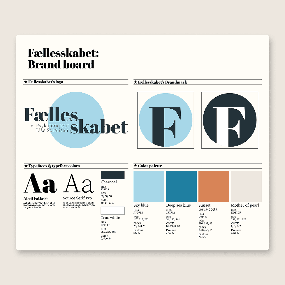
Brand Board for 'Fællesskabet'
About:
Fællesskabet is a therapy practice that also functions as a shared workspace for professionals within related fields. Drawing inspiration from the surrounding nature, the visual identity was designed to create a sense of calm, stability, and comfort, while supporting both individual reflection and a shared professional environment.
Design direction:
The visual direction was informed by the location in Holbæk, Denmark, where the space is situated near the coast. The color palette draws from the surrounding environment, combining light and deep blue tones with a terracotta accent to introduce contrast and balance.
The typography pairs an expressive serif display font with a more neutral serif for body text, creating a clear hierarchy that supports both character and readability. The system was also designed to be straightforward to apply, prioritising clarity and ease of use alongside aesthetics, to ensure it could be used consistently without requiring extensive design experience.
Implementation:
The final identity establishes a calm and consistent visual system that supports the dual nature of the space, balancing clarity, professionalism, and a softer, more welcoming tone. It also provides a clear foundation for decision-making across touchpoints, including social media graphics and other visual materials.